Swann House Phase 2: The Demolition
As we moved out of discovery and into demo, lots of treasures awaited the demo team. It was time to evaluate which components throughout the home made sense to keep and which parts of the home were miscellaneous additions throughout the years that perhaps could afford to go.
Let the demo begin!
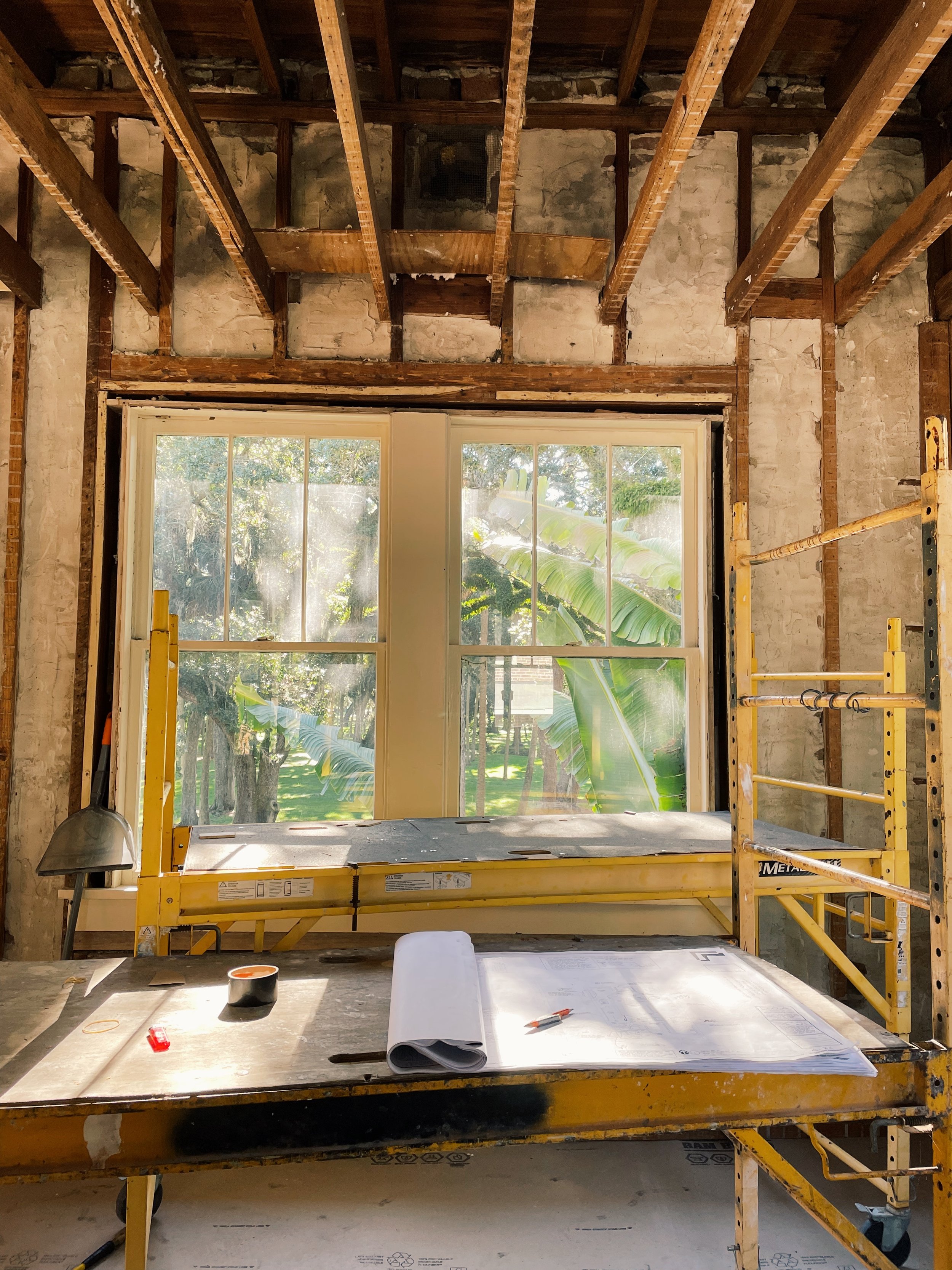
Upstairs demo views
Sunroom Windows
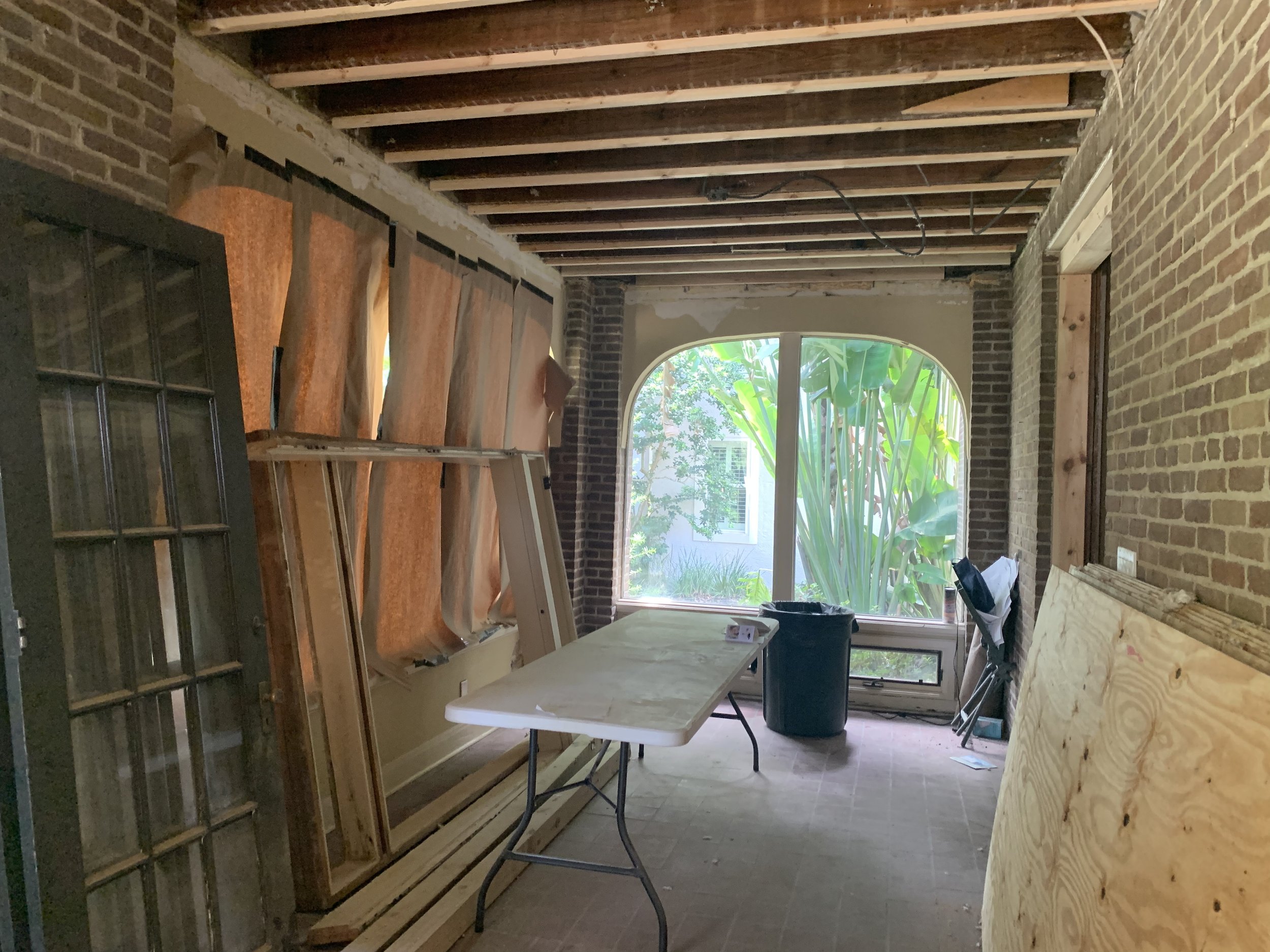
The wall of windows in the sunroom overlooks the beautiful tree-filled Swann Circle park and is a key focal point for the home. The windows are a unique and custom arched shape. Part of an addition, when the side porch was closed in years ago to create a sunroom, the huge panes of glass flood the room with light - especially beautiful in the morning. While not technically historic to the original 1926 bones, they’re iconic enough to the home and it’s location that they were deemed worth updating, while keeping the original shape.
Sunroom in Demo Phase
Fireplace
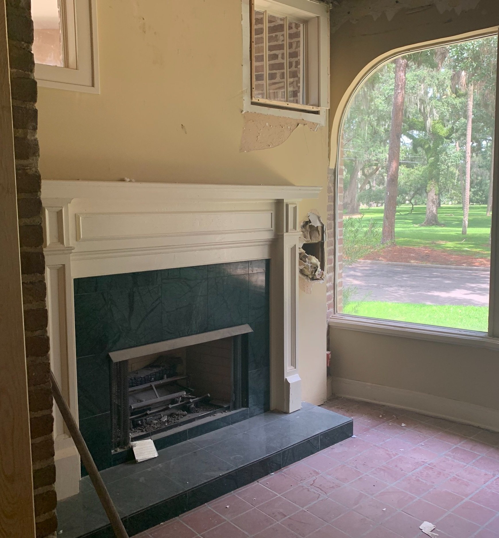
Also located in the sunroom, was the original fireplace with a simple wood mantel; complete with around 12 coats of paint. Colors through the ages. Our contractor stripped the mantel, with careful and patient sanding, down to the base. We will update the paint finish with a high gloss paint. Without the previous years of paint drips and putty distracting from the design, the fireplace can reach it’s full potential. The simple fireplace panel design inspired new millwork paneling through the sunroom, with painted finish to match fireplace, walls and ceiling.
Fireplace Before
Interior brick walls
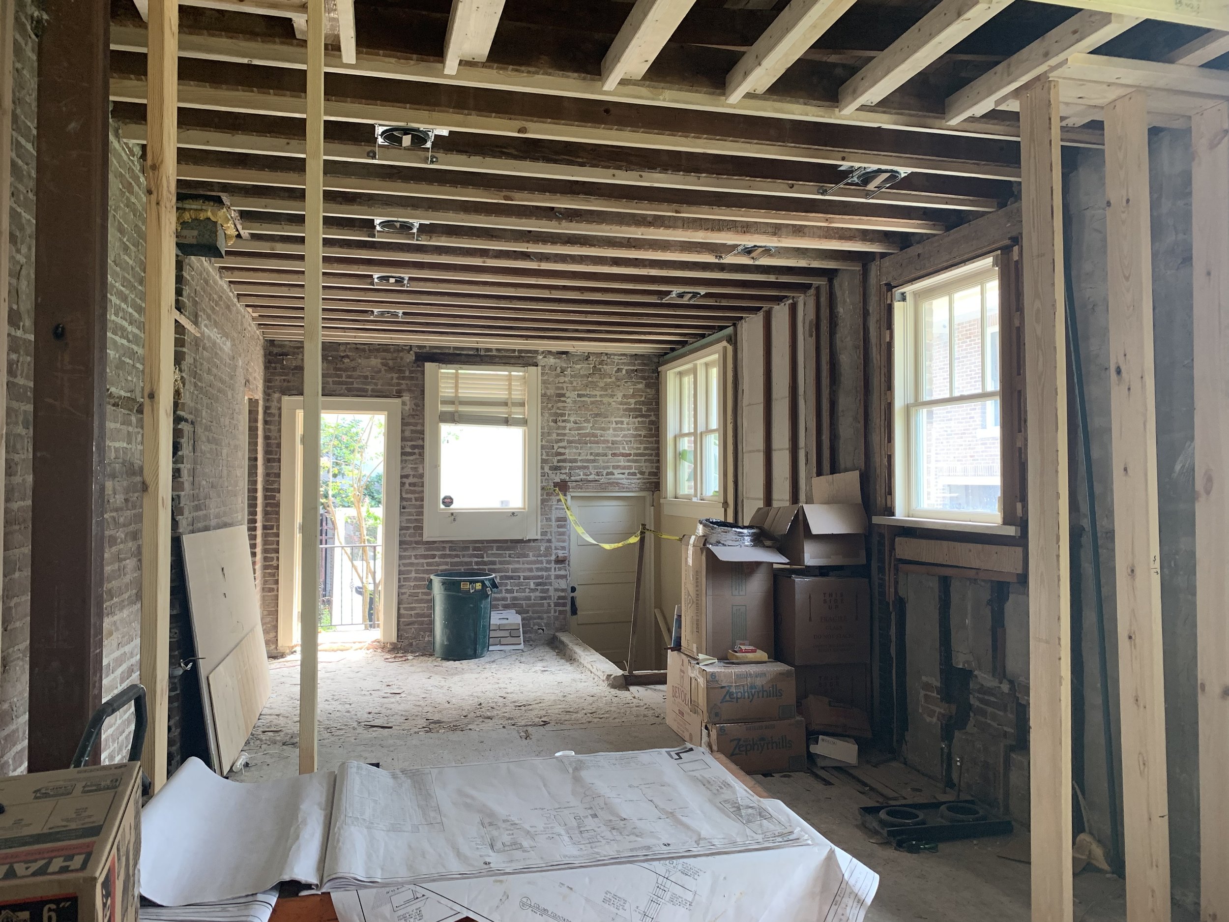
The brick walls in the sunroom were in even better shape that in the kitchen, and just needed some cleaning and mortar touch up. One of the joys was uncovering additional brick in the kitchen. On the exterior wall, covered in layers of drywall. The brick is a wonderful accent to the new window the homeowner decided to add. Flooding the kitchen with natural light.
Kitchen Range
Rewiring and replumbing the home was a daunting task. To make life a little easier, we decided left the kitchen range in the original location, centered on the wall in the kitchen that backs onto the main stair. Everything else was redesigned to create a more symmetrical kitchen with balanced details. Multiple kitchen renovations over the years had left the kitchen layout disjointed and cramped. The cabinetry was removed from the main wall of the kitchen, exposing beautiful brick walls – the perfect backdrop for the new space. The brick walls and grout needed more than a little love. They were carefully restored, patched and cleaned. But the original wiring holes and were left behind to add some character, with a nod to the past.
Kitchen Before
Separate kitchen and formal dining room
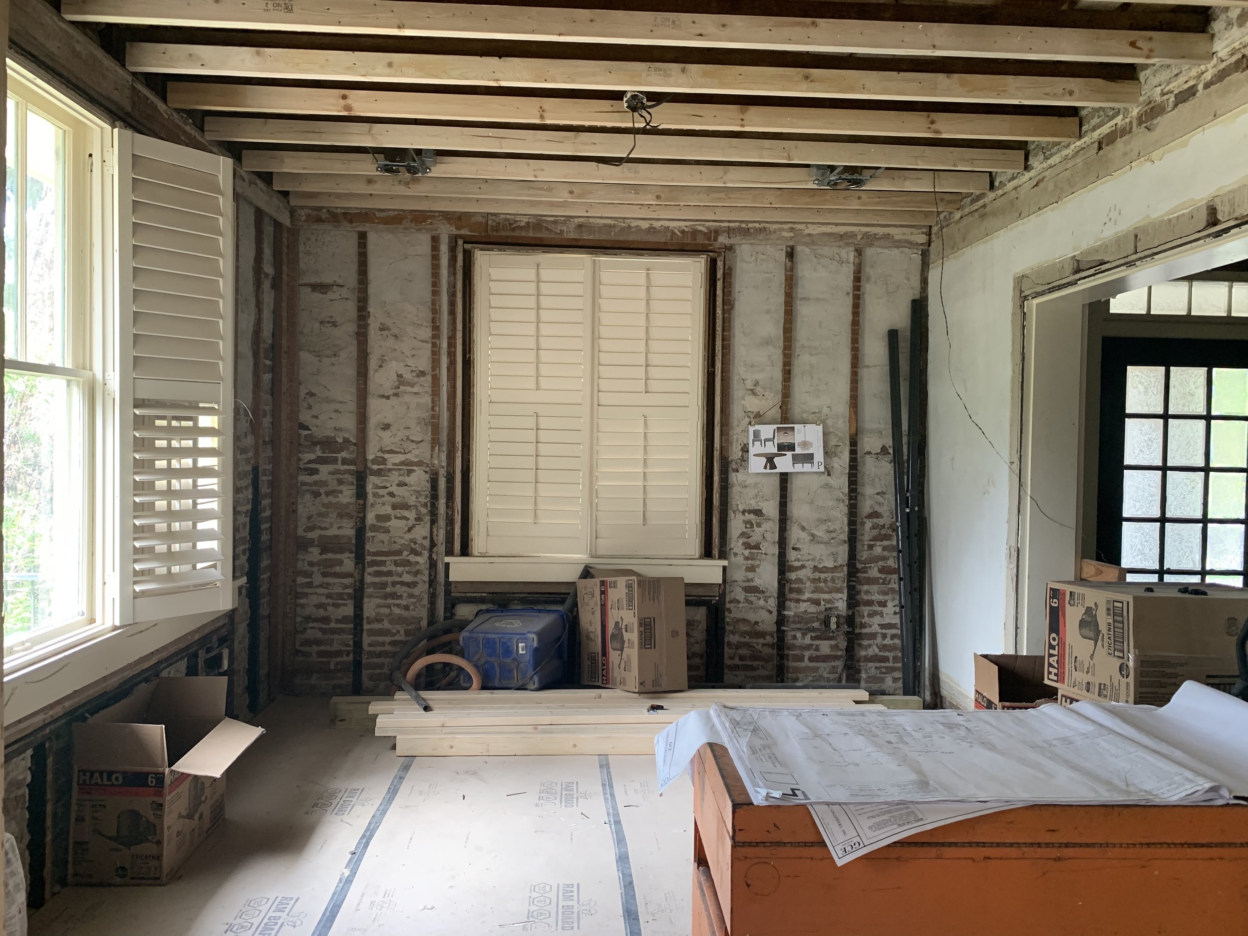
The dining room was small and closed off when our client purchased the home, and severely lacking in light due to the plantation shutters on all the windows. We loved the idea of keeping some separation between the kitchen and the dining room. The separation allows for a formality that the home seems to demand, but we created more space and invitation to the room by making the openings taller and wider.
Dining room Before
Staircase
We knew from the beginning that the staircase should have ties to the past while being updated for safety and design. The demo team carefully removed the original handrail and the too-short spindles. The baluster, originally stained wood, was hidden under layers of paint. The stair treads too had been painted black and the risers a dismal white, mostly hidden by the world’s saddest stair runner.
Staircase
The baluster is being carefully sanded back to it’s original wood, and will be stained to match the original wood railing. New spindles will bring the railing height to a more standard height, but we maintained the original influence, square spindles, painted white to match the trim.
Site visit
Demo and evaluation complete, the team moved on to reframing to define new rooms, more open bedrooms and a new master bedroom and bathroom suite to accentuate the views and maximize luxurious design details.

